OVVIVA - BRANDING
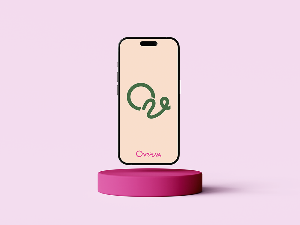
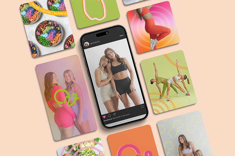
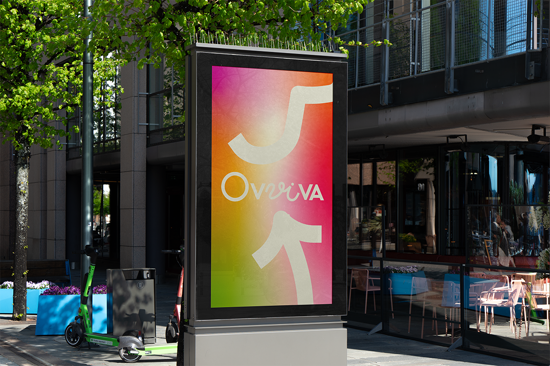
Ovviva is a health brand for women aiming to improve wellness through cycle-syncing. It addresses the confusion around female bodies due to limited research and gender-biased medical advice. Women’s monthly cycles have four hormone phases affecting mood, weight, energy, appetite, and sleep. Founded by two sisters, Ovviva offers clear guidance on diet, exercise, sleep, and mood management for each phase. They currently share resources on social media and plan to launch an app for tracking cycle phases, food, sleep, energy, and mood to help women better understand their bodies. The name says it all as “Ov” is latin for “Egg”, and “viva” is latin for “Live”.
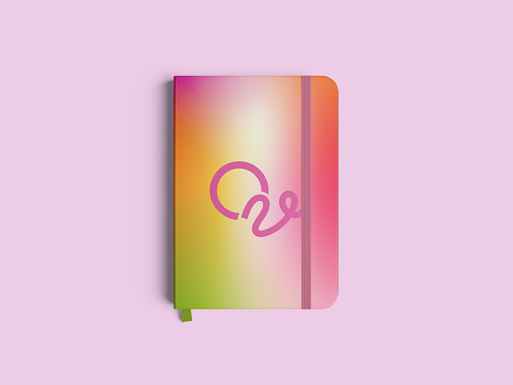
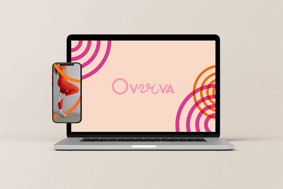
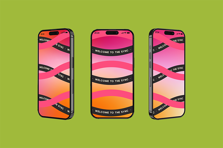
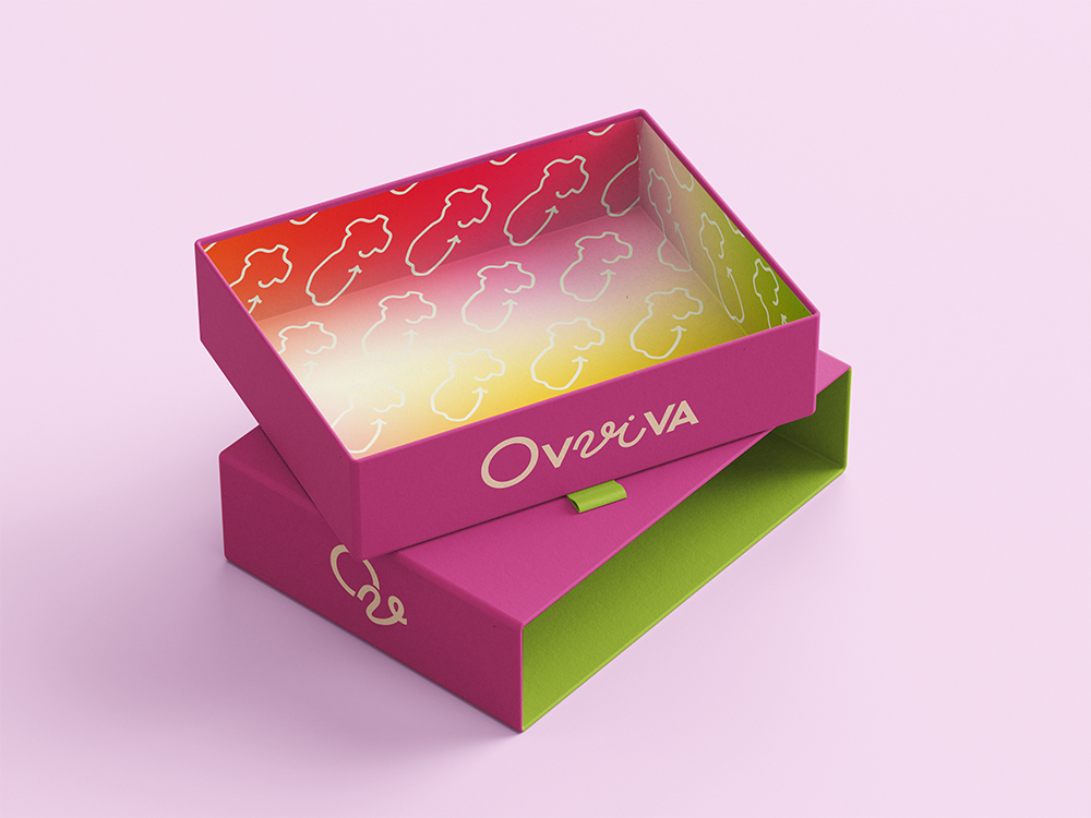
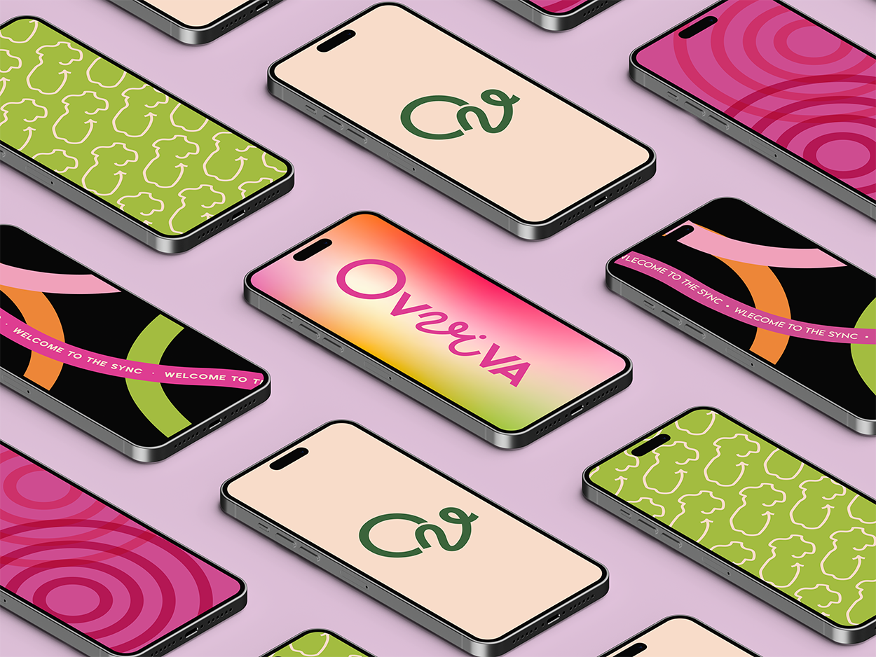
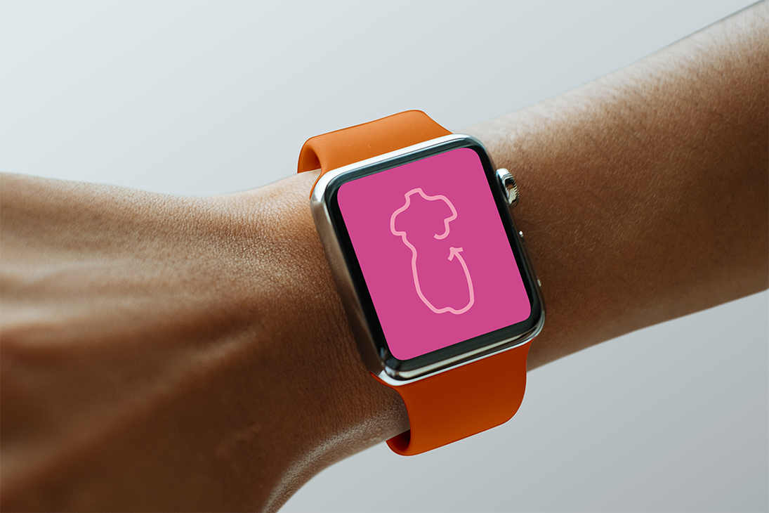
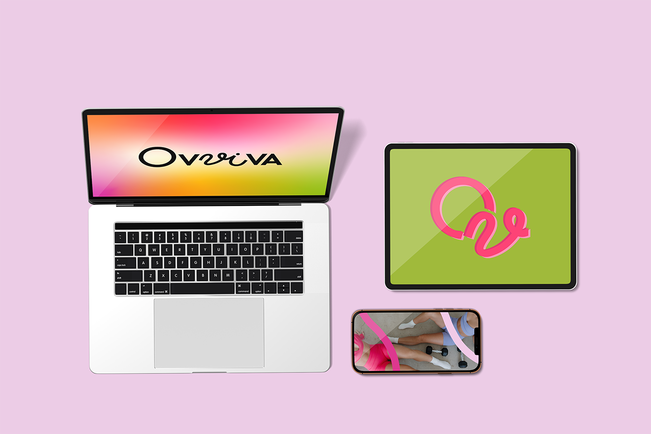
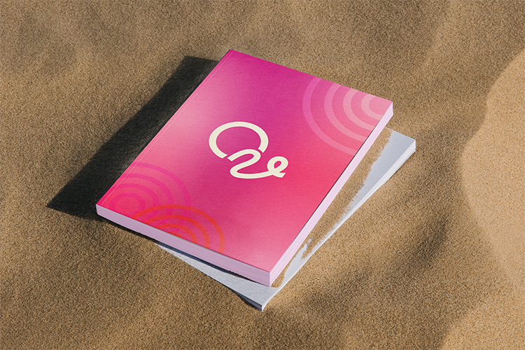
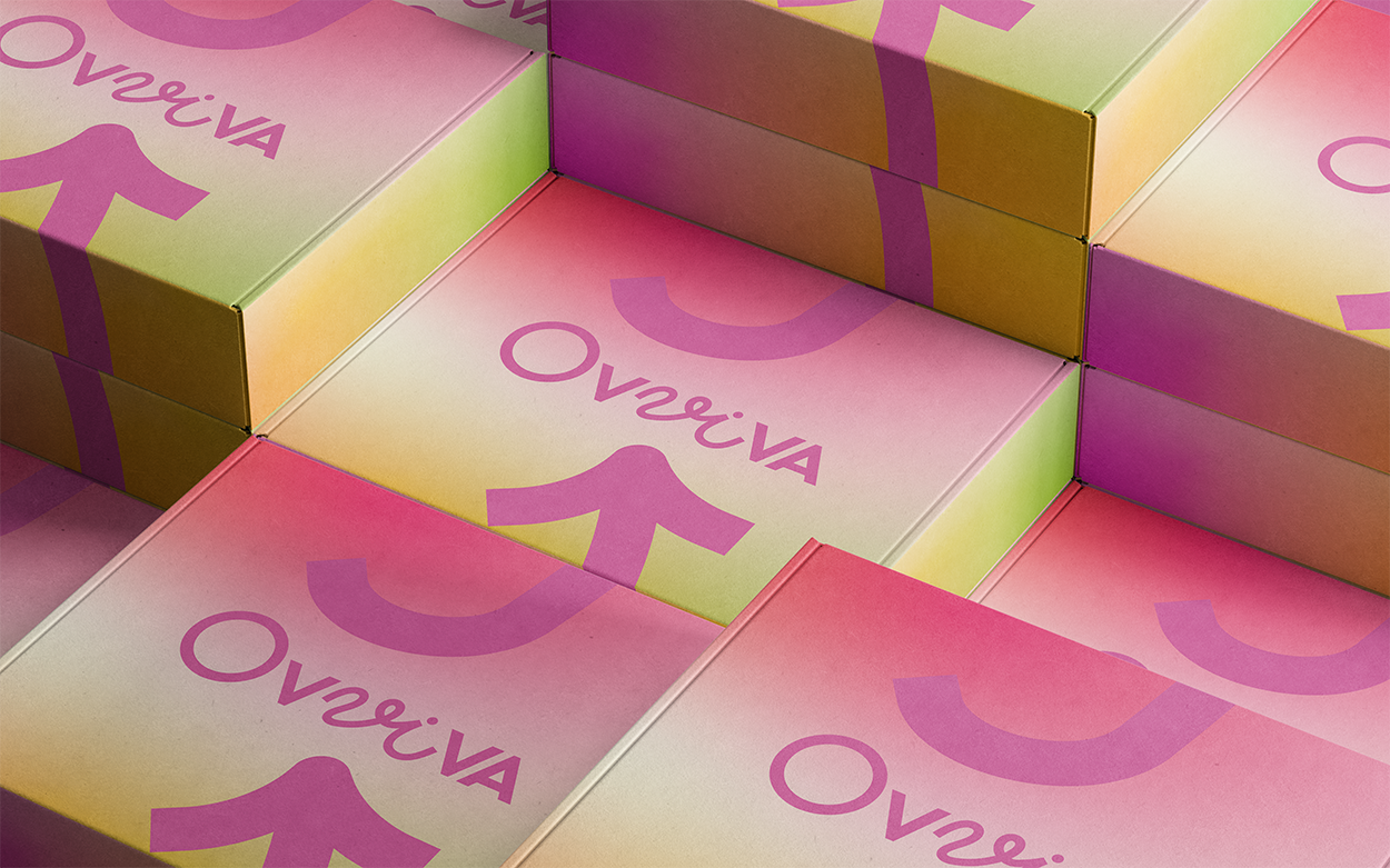
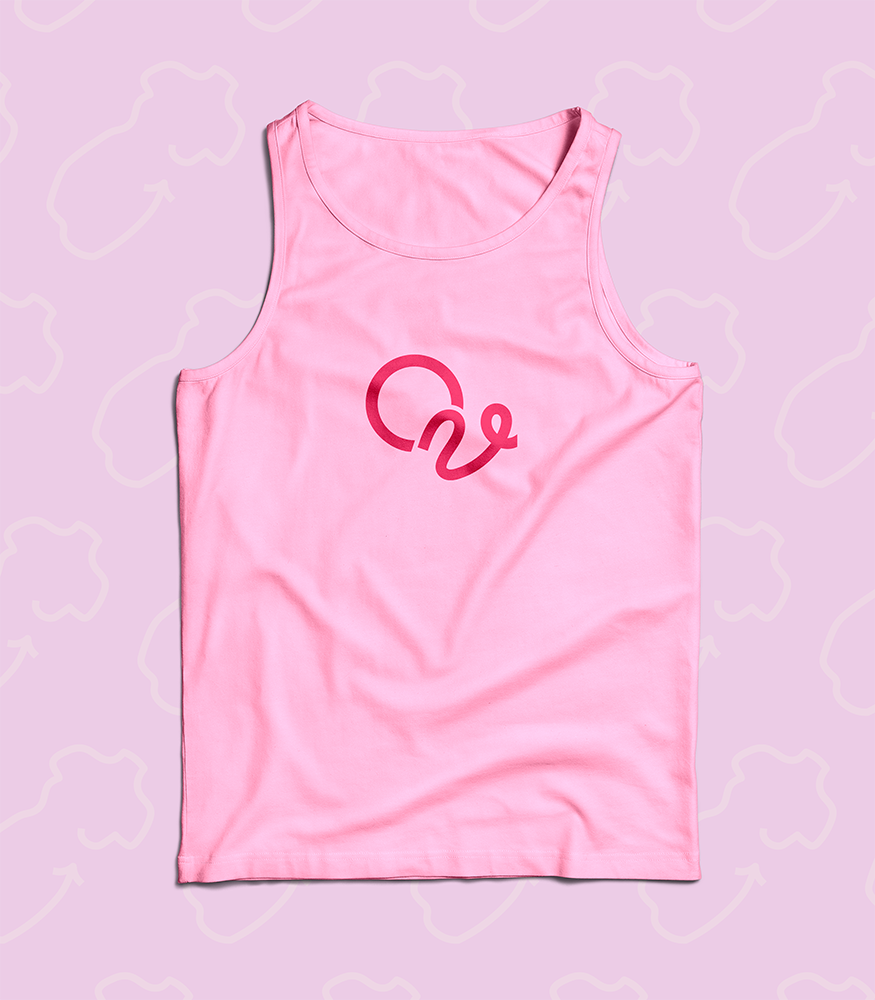
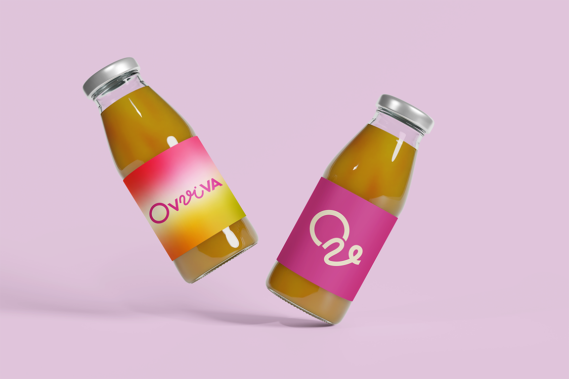
The visual identity for Ovviva needed to be feminine, but not overtly to include women with more masculine energy. It needed to be bright, playful, friendly, fun and professional. With that idea in mind, I got to work curating a bright color palette of pinks, oranges, and greens, which helped set the tone for the rest of the visual identity. I created custom type for the logo-mark, and used elements from that logo to create the letter-mark, and Icon. All communicate the changes from phase to phase of the cycle and the feminine energy. I created visually fun graphics that work well for social and UX/UI application. I provided the visual direction and established the brand voice surrounding the visual identity of Ovviva to help the sisters actively bring some fun, and peace of mind to women when it comes to their cycles.
View the Brand guide here:
https://drive.google.com/file/d/1CmkgFau3RVzdAhOJaS51nVA_FPy9wCT3/view?usp=sharing