IHUB - REBRAND
I had the incredible opportunity earlier this year to help rebrand the Innovation Hub of Utah, IHUB for short. They are a non-profit that provides resources and mentorships for young entrepreneurs in Utah looking to maximize their personal success along with the success of their budding start-up companies. Since IHUB is also a young business, they needed to get their branding done quickly when they started in 2024. As a result of their growth, popularity, and recognition, they wanted to rebrand themselves more formally for their target demographic of the young entrepreneur.
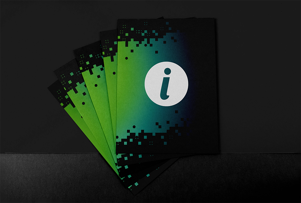
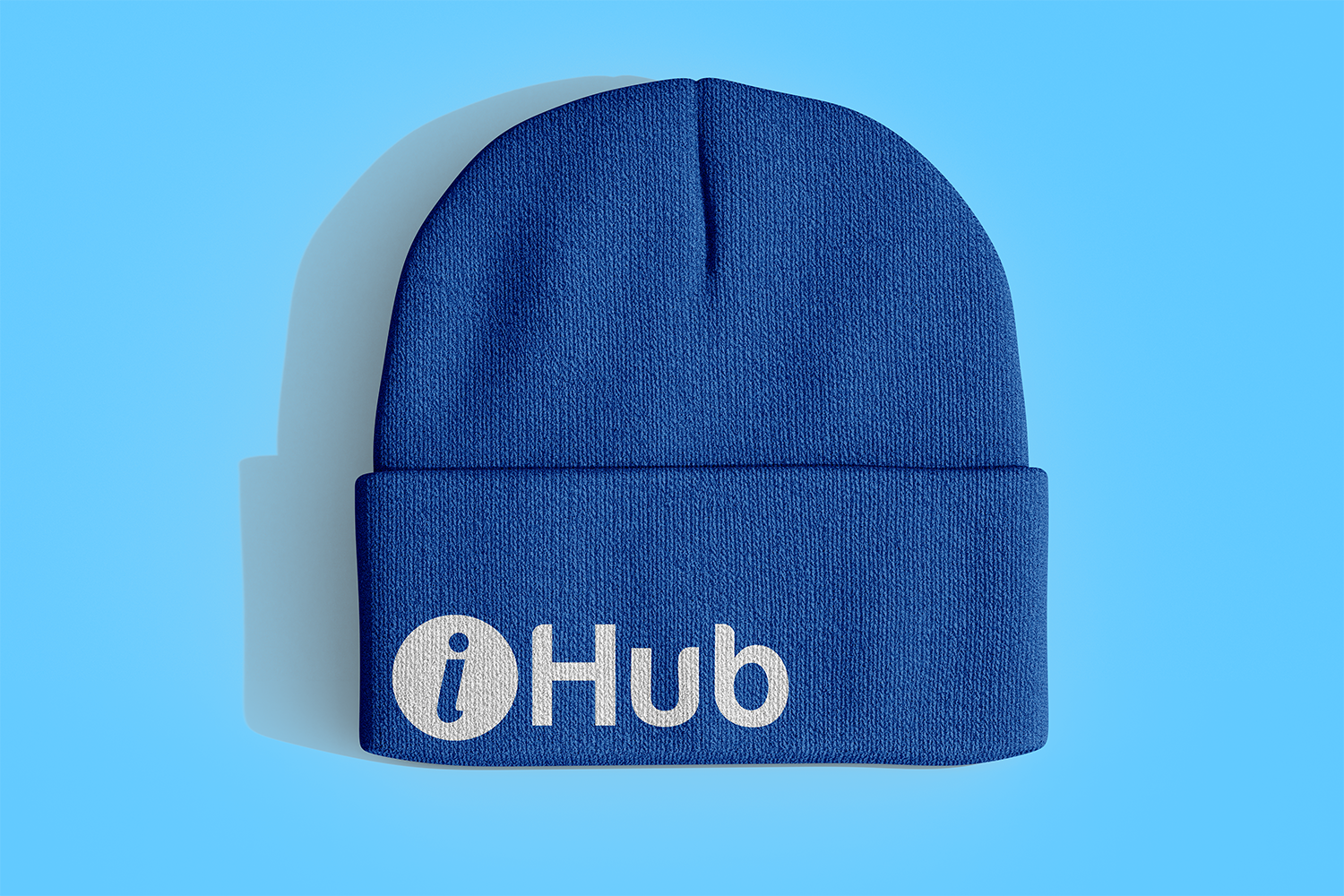
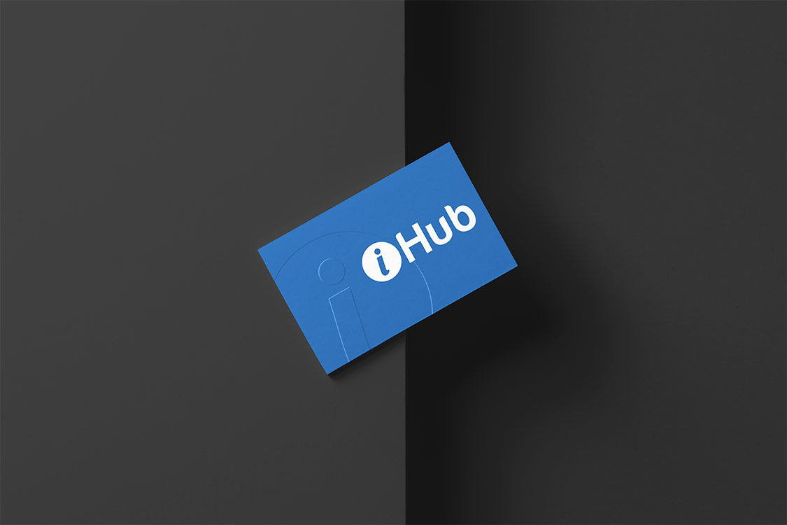
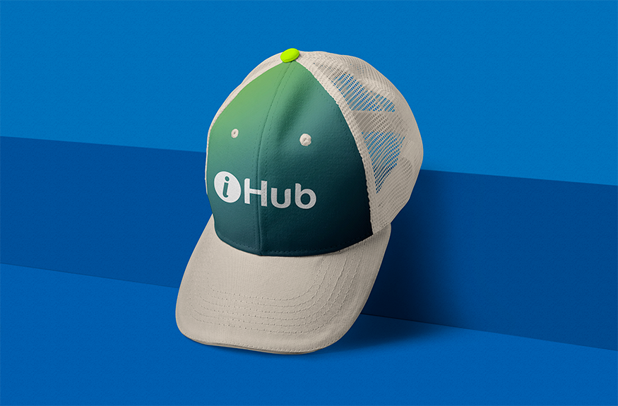
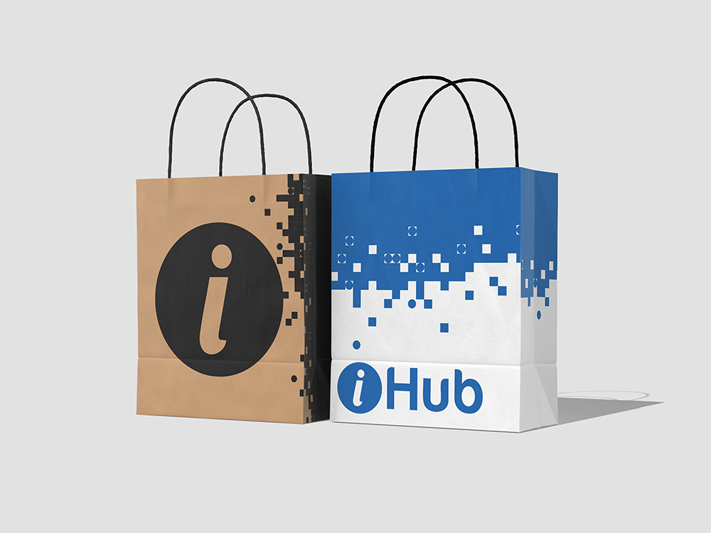
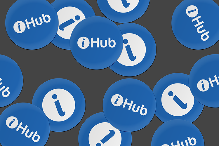
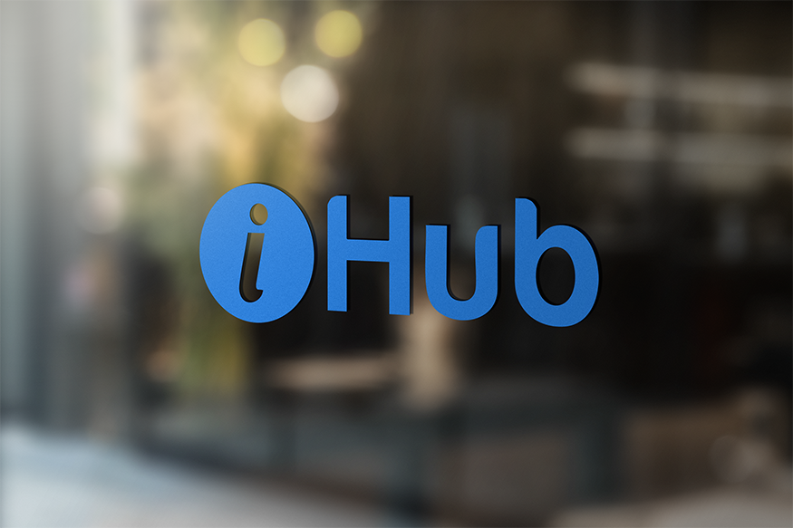
IHUB wanted their brand to exude cool kid energy mixed with inclusivity for all entrepreneurs. They asked for something young, professional, fun, and above all else, really cool. They had the logo, logomarks, main typeface, and the basic color pallet of blue and white. These elements were already so engrained into their brand, that these items became non-negotiable for IHUB, which presented me with an exciting challenge on how to create a brand that looked like the cool kid on the block.
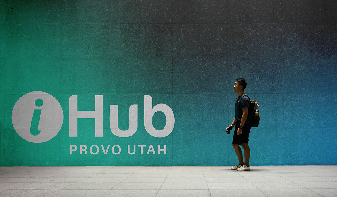
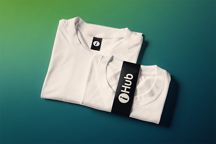
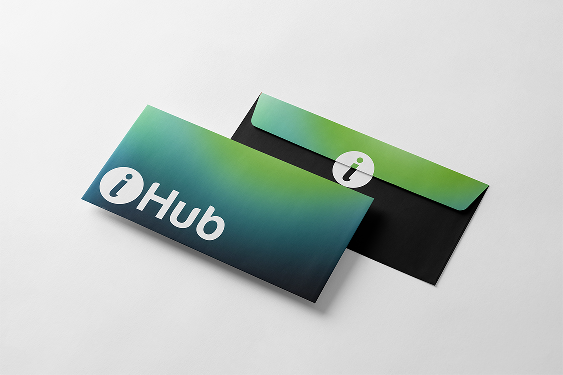
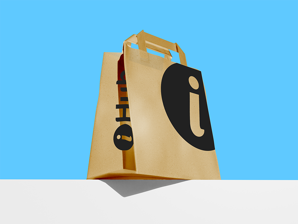
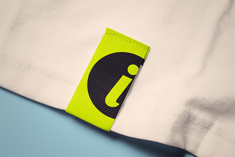
I decided the best way to do this was not to make massive changes, but to add and expand on those additions. I started with adding 3 colors to the color palette: charcoal black, a neon green, and a bright neon blue. I also added 2 different typefaces for headers and body copy. I created all new graphic assets for them including branded gradients. I helped to define the brand voice, and the direction that photography and branded print and apparel items should take. Futuristic, professional, fun, and cool to the max. This project was incredibly fun, and challenging. I’m very grateful to IHUB for giving me the opportunity to help shape their visual identity for the present and future of the Innovation Hub of Utah!
View the Brand guide here:
https://drive.google.com/file/d/1M_YB05s1ycP2qsiNts0F0DNNVeh9jrfd/view?usp=sharing